Business owners are constantly craving more subscribers.
Am I right?
You’ve got a bangin’ product ready to fly off the digital shelf and all you need are qualified buyers.
What if I told you that I generated 1,785+ leads organically with a 2-minute quiz using Interact?
Would you be interested in doing something similar?
If so, you’re in luck because that’s what this quiz case study entails.
Without paying a cent on advertising, you’ll be able to use this guide to:
It was all organic over the span of a year with no fancy promotion schedule or shove-in-the-face pop-ups.
In this article, I’m going to show you how to replicate my lead-generating quiz success for yourself 🙂
Inside, we’ll be discussing:
- Brainstorming
- Quiz types and templates
- Cover page
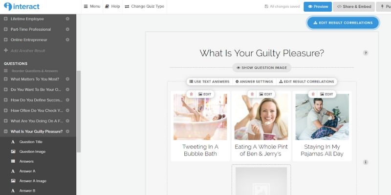
- Questions
- Results
- Integration mapping
- Website placement
- Analytics
Let’s get started!
How to Create an Online Quiz That Converts Like Crazy
Quizzes are SO much fun!
I’m sure you’ve spent waaaaay too much time on Facebook taking quizzes from Buzzfeed that try to ascertain your unicorn superpower and celebrity boyfriend choices.
Yes, that really does exist in case you were curious 😉
My point is that if your audience is people, they will also enjoy lead-generating quizzes.
Quizzes are a fine example of interactive marketing and that’s the direction that I think the marketing world is moving in. Plus, this is kind of like those adventure books where you get to choose your own fate.
And, I secretly think people want to know more about themselves than they would like to admit.
It was Dr. Rorshach (the inkblot guy) that said…
We crave the peace of mind that comes from believing the human condition is quantifiable.
It’s so true!
We want to know how we fit into society and you can take advantage of that principle in your business model.
As previously mentioned, when discussing quizzes that convert, these are the important steps I’ve compiled based on my quiz case study:
- Brainstorming
- Quiz types and templates
- Cover page
- Questions
- Results
- Integration mapping
- Website placement
- Analytics
Without further ado, I’m going to take you behind the scenes of my quiz that generated over 1,785+ leads completely organically.
Are you ready?
And, in case you had any doubt as to if I’m qualified to guide you through these steps, I am!
Below is my Interact partner badge 🙂
1. Brainstorming a Lead-Generating Quiz
The first thing you should do before starting anything is to brainstorm!
You can do this on paper or on your computer.
What you’ll want to do is first figure out the topic. We then want to reengineer the entire process of the quiz by starting at the final result.
So, it’s critical that you know what you want your quiz to accomplish. Quizzes are a great way to segment your audience (Interact makes that super EASY, but we’ll get into that later), so understand your objectives going in.
When I created my quiz entitled “What is Your True Career Destiny?”, I knew that I wanted the objective to have different kinds of careers. This would allow me to send tailored content to each person based on their results:
- Part-Time Employee
- Lifetime Employee
- Future CEO
- Online Entrepreneur
It also helps to survey your audience.
I remember creating a simple graphic using Canva and then blasting it out to a few Facebook groups.
It was as simple as this…

I compiled my results in a spreadsheet and then began crafting my results and paths from what people in my audience wanted.
Not me!
That’s so important — the quiz has to work for your AUDIENCE so they can identify with it.
Once you’ve done this, you’re ready for step 2.
2. Quiz Types and Templates
There are 3 types of quizzes you should know about:
- Personality quizzes
- Scored quizzes
- Assessment quizzes
Most people will be creating personality quizzes, but there are uses for the other ones! I just find that personality quizzes have more of a likelihood to be shared socially.
I did some published research on this topic if you want to learn more about why scored quizzes aren’t shared as frequently.
Either way, Interact has some amazing explanations of the different kinds of quizzes on their homepage and even examples of each.
After you decide what your quiz is about (mine was a personality quiz), you can either choose to:
- Create from scratch
- Create using a template
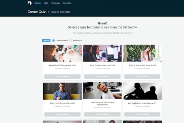
The beauty of using a template is that there are 800+ templates that Interact has for you to choose from!
And, after you choose the industry you’re involved in (such as DIY, beauty, blogging, business, and more), Interact will go ahead and sort the templates automatically by CONVERSION RATE.
This means that you’ll by default be setting up a successful quiz 🙂
Here’s a look at some templates:
You may even find one about the very topic that your quiz is about.
Then, all you have to do is spice it up with some of your bomb-diggity copywriting and you’ll be set 🙂
Now, you might be thinking that quiz templates are like Pinterest templates in that everyone uses them and you can’t just leave them as is.
But, I find that the templates Interact provides are BETTER FOR STRUCTURE than they are for content.
So, leave the high-converting structure and just adapt the subject matter. Based on your objectives, your quiz questions will be different from the template, so customize it there.
3. Cover Page
The cover page has to be exciting! It has to pique your audience’s attention and convince them to click through.
This is what mine looks like:
Here’s what I like about it…
- The title is a question, which encourages people to want to find out the answer
- The image evokes feelings and emotion
- The description takes advantage of a common issue that I found and markets the quiz as the solution to answering it
- The call-to-action button is personalized to the user’s action
All of this is super simple to set up in Interact!
And, I just used stock photography (this specific photo was from BigStockPhoto) and resized all the graphics in Canva.
When you go into Interact, you’ll be able to customize things like:
- Font type
- Font color
- Button color
- Background color
These branding choices will also carry over to the next section, quiz questions.
I think it’s helpful to make these branding choices based on your current brand so it displays cohesively on your website.
4. Quiz Questions
These are the FUN part!
I looooove creating quiz questions.
Just understand that your first few will be terrible and that you shouldn’t give up when you start out. You’ll probably need to write 15 to 20 questions to end up with your final 10.
At least.
It took me a long time to develop my brand voice, especially for email marketing.
The best Interact quizzes are personalized to your specific brand.
They should be hyper-specific and so personalized that there’s no way anyone else would create it.
I literally do all of these things, so the questions and the possible answer choices make perfect sense.
(Yes, it is as glamorous as it seems!)
I’ve found that images do help, but I don’t have any quantifiable data to support that claim. But, use images that represent your target audience. For me, that’s two-thirds women and one-third men.
The questions should be simple to answer!
A quiz should take no longer than 2-3 minutes total.
That breaks down to 7-10 questions.
And, make sure you show your personality!

5. Quiz Results
Ah, the results.
The dreaded time for the user as they complete the quiz and await their fate (hey, that rhymes!).
Right before the user receives their results is when most marketers insert their squeeze page, also known as a landing page, to capture an email.
But, I love Interact quizzes because they provide you a few options:
- Forced opt-in: the user doesn’t get results unless they provide their email address and any other fields you require (less quality, higher quantity)
- Optional opt-in: the user can elect to not opt-in in and still receive the results (higher quality, less quantity)
- No opt-in: the user is directed right to the results (capture the opt-in on the results page with your CTA button)
There are uses for each of these!
And, testing out which works better for your audience is critical to YOUR success. Remember, what works for me or the majority of quiz marketers may not necessarily work for you.
When the quiz taker gets their results, it will look something like this (and you have full customization over it):
This is my most popular result!
As you can see, you can have a description (as short or as long as you want) and then a CTA button at the bottom. And, you can customize that, too.
But, you can also opt (and this is a settings option) to direct the results page to another webpage. I’ve seen gorgeous results pages created for quizzes and it’s something I plan on doing in the future.
You can create them with:
- Elementor
- Gutenberg + Atomic Blocks
- Thrive Themes
- Beaver Builder
- Leadpages
And more!
This is why I love Interact 🙂
They’re literally the best!
They provide the best quiz options and customizations for online entrepreneurs like you and me.
You can even be fancy-schmancy and include something like a GoViral campaign before the results are given to encourage social sharing in exchange for an additional freebie.
Also something I’m going to try!
6. Integration Mapping
This is a fancy-schmancy term for connecting your quiz to your email responder.
I use ConvertKit and absolutely love it!
Side note: I even got to meet some of their team at FinCon this year 🙂
What I love about the integration with ConvertKit is that it’s completely native. No third-party companies like Zapier are required.
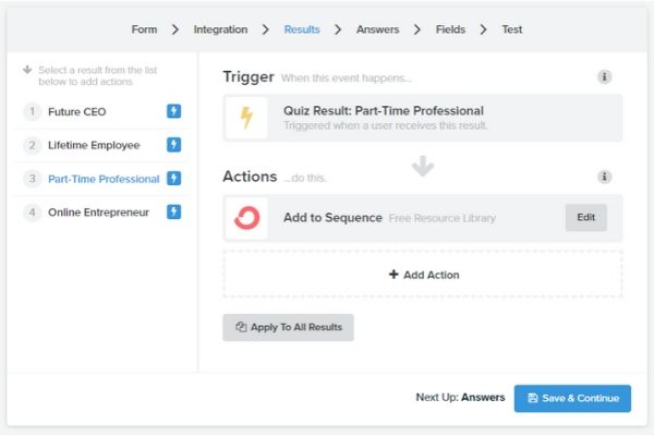
You can even choose to map out each individual response to a separate sequence or all of them to one sequence.
For segmentation purposes, separate is ideal, but it depends on your marketing objectives.
Here’s an example of what it looks like:
What I love about Interact is just how user-friendly this is to set up.
In ConvertKit, your options are:
- Adding to sequence
- Adding to form
- Updating subscriber field
Just know this in advance so you can appropriately set all this up in ConvertKit before trying to integrate it with Interact 🙂
7. Website Placement for Your Quiz
There are a couple of approaches to this:
- Embedded on webpage
- Hosted by Interact
I like the first option because it looks more natural to your audience.
I also use Javascript embedding, so it renders well on mobile devices.
Don’t forget that the majority of your quiz takers will be on their phones!
Interact even has a plugin to help you insert your quizzes with simple shortcode if you’re not as technical.
Once you’ve placed the quiz in the right spot for your efforts, then it’s time to promote it!
Make sure you keep the URL of the page short and sweet so it doesn’t look too ugly when promoting it, especially if you’re promoting it with paid advertising.
For example:
- Drewduboff.com/career-destiny
- Quizzalicious.com/quiz
Here are a few of my favorite promotional channels:
- Announcement bar
- Header banner
- Email list
My quiz has been exclusively promoted on Pinterest, but I’ve promoted others in different ways.
What’s important for you to understand is that my Interact quiz garnered over 1,785+ leads in just over a year completely organically through Pinterest.
It’s located at the top of the search when I enter in “career destiny.”

It is at the top left and even outranks some promoted pins (which people are paying money for and I’m doing better than they are!).
The beauty is that I have only pinned it a few times and then Pinterest has done the rest. It shot up straight to the top of the search in a few short months and has stayed there since.
Can’t beat organic traffic!
8. Quiz Analytics
I love diving into quiz analytics!
So much so that I even developed my own Google Analytics quiz dashboard for my personal use 🙂
Pretty nerdy, right?
Well, you don’t even have to get that technical to understand your analytics.
Interact makes the process super simple as you can access the analytics right from your dashboard.
Here’s a snapshot of the analytics from my quiz where I generated over 1,785+ leads in just over a year:
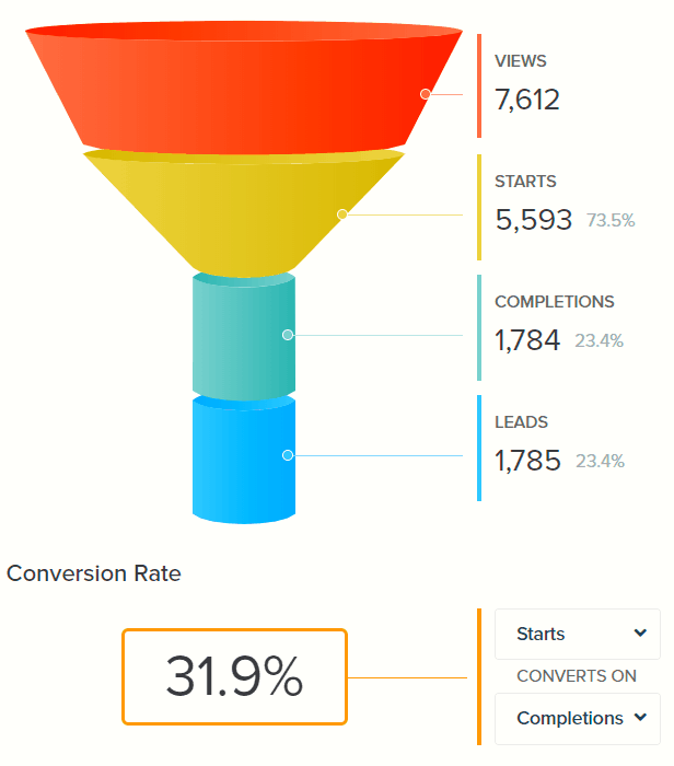
As you can see, my quiz has converted at over 30%!
For cold traffic, I think that’s pretty impressive 🙂
There are also more statistics in the Interact analytics dashboard, such as:
- Top results
- Drop off points
- Results breakdown
- Total time the quiz took to complete
You can even create new content based on what your audience has already expressed an interest in.
And, in case you were curious, my audience prefers being in their pajamas all day as a guilty pleasure 🙂

Conclusion
If you’ve learned anything from this quiz case study, I hope that you know that what I’ve done is nothing overly complicated or challenging.
I’ve reached out to Interact support before and they’re always so friendly.
My biggest piece of advice is to plan out your quiz before you start putting it into Interact so you can be focused on inputting instead of brainstorming.
In case you skipped to the end (I still love you), here’s what we discussed in this quiz case study:
- Brainstorming
- Quiz types and templates
- Cover page
- Questions
- Results
- Integration mapping
- Website placement
- Analytics
Do you have any questions about quizzes? Or, Interact?
Let me know in the comments below!
Remember, they’re my favorite quiz builder and will make the quiz creation process SO easy 🙂
If you want to sound out your quiz idea first, let me know below, too. Interact even has branching logic, which is a more advanced feature that may fit your audience better.
Cheers to quiz creation success!

Note: I currently have opt-ins disabled on this quiz. It was created before I rebranded and no longer makes sense for me to keep the subscribers. But, I keep it set up to report on analytics and how it performs. I may decide to repurpose the subscribers later on with another site, so I definitely recommend including an opt-in or your analytics options are more limited.


